ANN PIBAL / BIO – EXHIBITIONS – WRITING – CONTACT – @ANNPIBAL
Abstract Tendencies, Selections, Fall
The Drawing Center, New York, NY
October 31 – December 15 2002
Organized By Luis Camnitzer and Catherine de Zegher
Catalog with essays by Susette Min and Lytle Shaw
“Color is almost brand new in the world.”
– Donald Judd
The classic color theorists might have described khaki as the hue most at peace with cubicle-based productivity, most receptive to imposed social order. Seeking to understand colors not only as chromatic but as social values, they would certainly ave noted that, at once pliant and Rotarian, khaki shuns chromatic confrontation, instead basking quietly in the reflected blue of its upper compliment. But as it has pursued this kind of ethical Pantone, color theory has generally been written in carefully controlled atmospheres, where color swatches are the only source of information. less frequently is it attempted amid the taxonomic rush of urban life, with its jarring and temporary effects, its involuntary after-images, its advertising vortexes, softly absorbing and re-directing attention. Context, in fact, has always been a problem for color theorists, and practitioners: not only the bleeds from surrounding shades, or the distortion from observing bodies, but the problem of establishing what one could call a genre for the color experience in question. Instead of seeking the essence of blue in the ether, one now asks whether one is registering a given teal as the primary hue of a 40-foot Madison Avenue skirt billboard or as a continent of indeterminate food stain glimpsed on a passing t-shirt? A shag carpet close-up? Or as the central rectangle of a color-field painting within the airconditioned hum of a national museum? What binds colors to particular contexts? What gives them the authority to operate not as packages, say, but as affective art experiences referencing a history of such prior experiences?
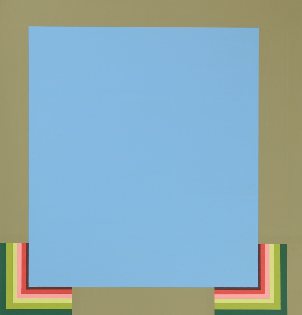
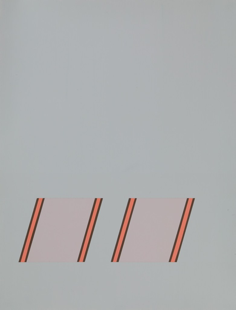
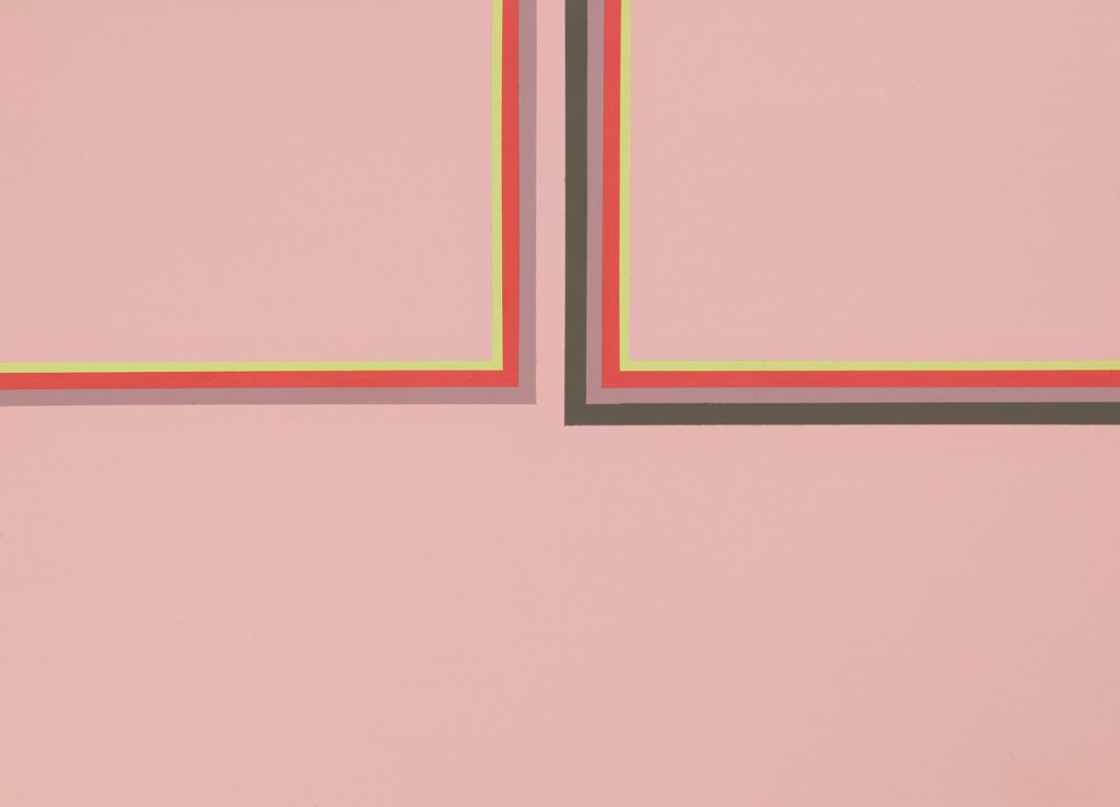
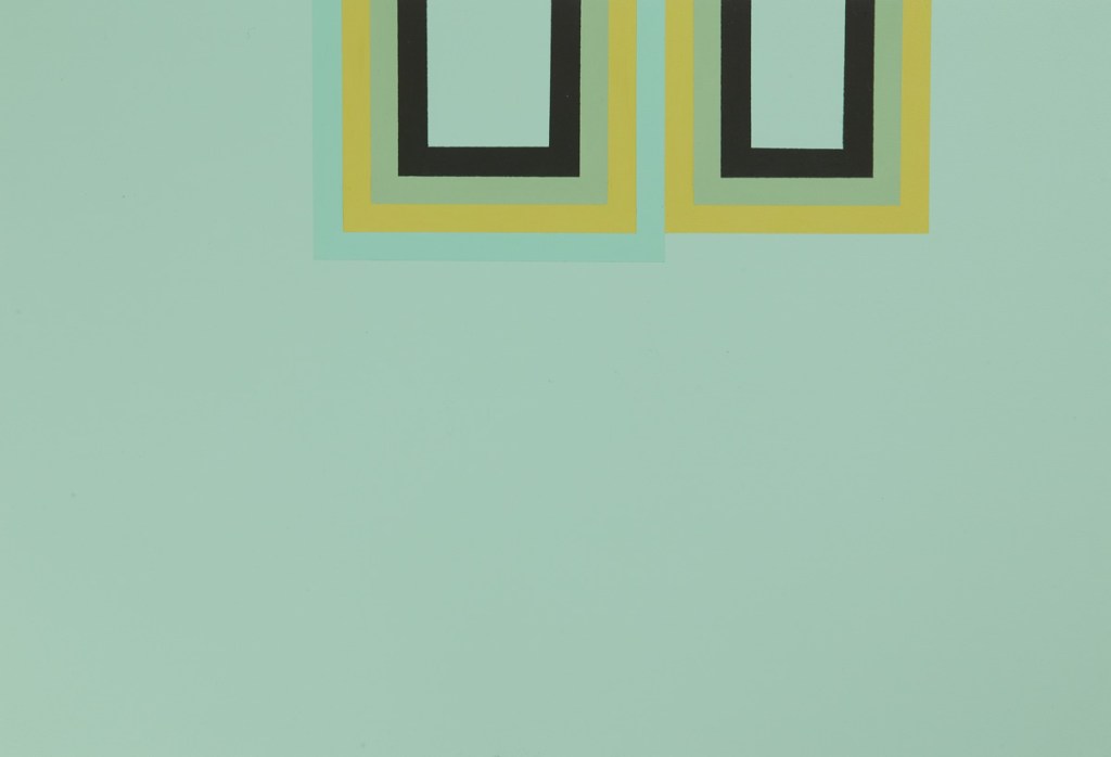
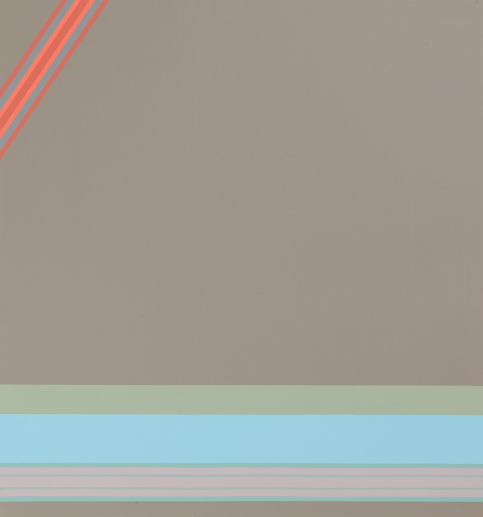
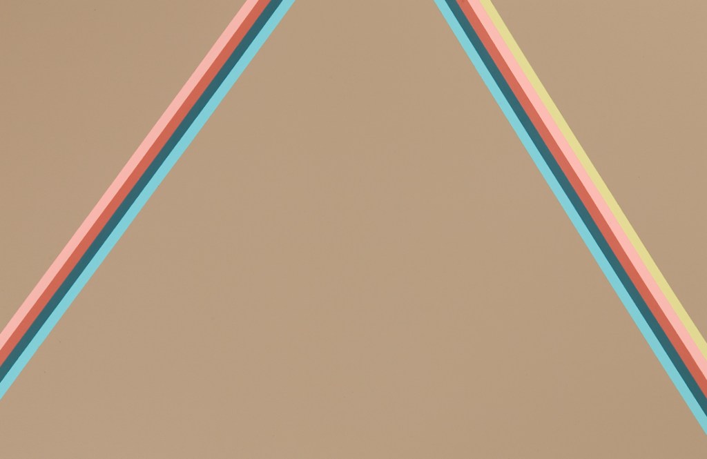
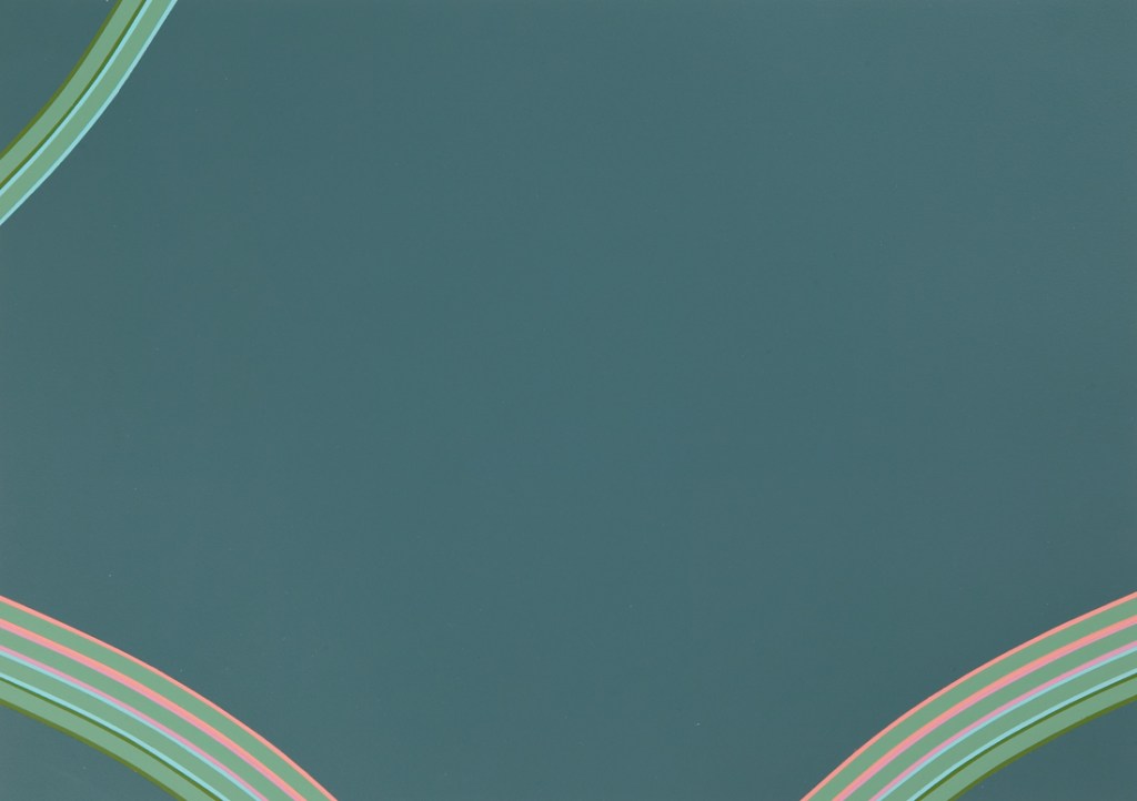
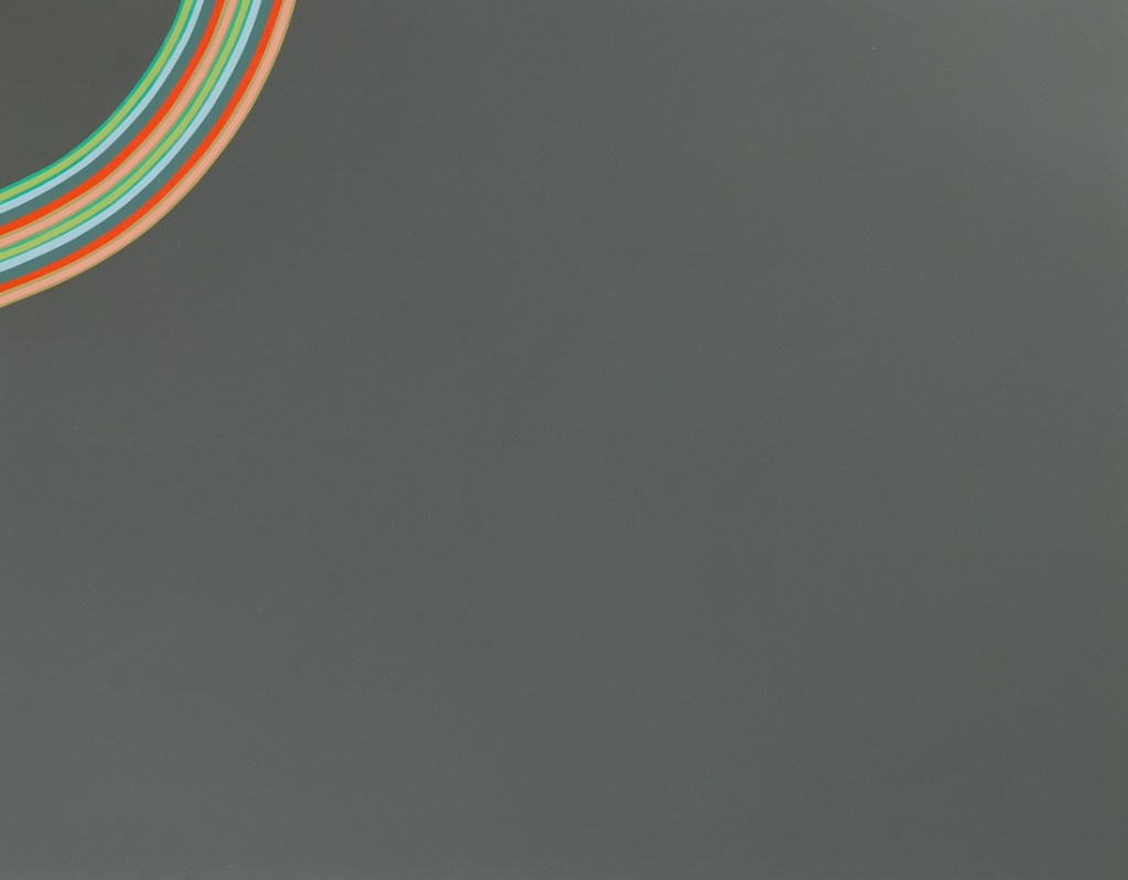
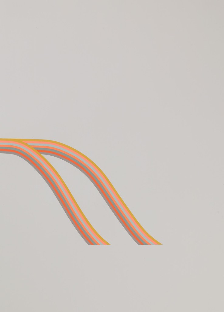
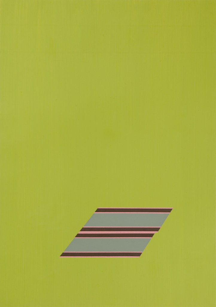
Confronting these questions in her drawn treatises on the subject, Ann Pibal often repeats linear color sequences within parallel bands as a way to assert for the almost arbitrary color of the first line a second, companion color, which together form a context — an Institution, even. This desire for self-grounding might explain the doublings and near symmetries in her acrylic on Mylar drawings, in which double strips of orange, slate gray, and navy blue appear, for instance, against a darker gray background — or, in which similar bands team up to form two nearly identical parallelograms on a pea-soup green field, one inching just beyond the other — inching from contrast study, perhaps, almost to logo. And it is perhaps this slight hint of the commercial world that signals, even more directly, the nature of Pibal’s color inquiries, where the institutionally insulated atmospheres of contrasting colors precious to the color-field painters slide into a less-bounded design context — the German electronica cd cover, the Swedish cookie package. In the past, this sliding was understood as a popular cultural challenge to high art, a jolting movement from high to low. But now, when few question the absorptive, aesthetic lure of cookie packages and cd-covers, such shifts have themselves become almost as smooth and seamless as the packaging pibal references. The result is a kind of pan-disciplinary aesthetic absorption that emerges precisely where these jolts used to occur. Thus one moves from the now almost vulgar previous language of contradictions and contrasts to a vocabulary of inflections, codings, and subtle perceptual re-alignments — a language which might account for not only cultural space, but the literal design space, of pibal’s work.
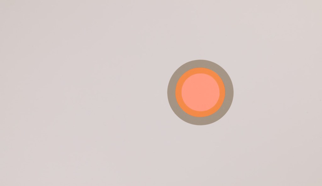
Enacting a range of doublings, recessions, and coverings in indeterminate space, color in Pibal’s work seems to guide us through this new aesthetic gray zone, its seemingly objective bands nearly eschewing the arbitrary gesture. If we are even tempted to treat some of the more authoritative, simpler pieces as mandalas of this new universe, such discreteness and finality oscillates with a sense of them as linked coordinates. Pibal’s work thus seems at once to build off a shared, slowly transforming palate, and, at least temporarily, to obliterate a certain kind of consciousness — call it “memory” — by allowing absorption into each environment in a way that only work concerned with color’s uncontainable semantic range can do.
— Lytle Shaw